Charts
You can use the grexx-charts class in an HTML template to display a chart anywhere the template is rendered, including template widgets and tile widgets.
Charts allow you to plot values from a dataset as a bar, line, or area chart. For example, you can chart the number of orders placed each day, the temperature readings sent by a device, or the budget and actual spend for multiple departments over a period of time.
When using the grexx-charts class, you can only display numeric and time series data. Charts are rendered with Apache ECharts. You don't need to write any JavaScript. To display other types of chart, such as a pie or donut chart, use a plugin.
Add a chart to a template
A chart requires a dataset to read from, and at least one series that describes what to plot.
You add a chart by including a div element with the grexx-charts class in a saved or inline template, and then configuring the chart with data-grexx-chart- attributes.
The following template plots the value of the amount column against the order date column:
<div
    class="grexx-charts"
    data-grexx-chart-dataset="1:2345:67890"
    data-grexx-chart-series='[
        {
            "type": "line",
            "label": "Revenue",
            "xColumn": "order date",
            "valueColumn": "amount",
            "dataType": "column"
        }
    ]'
></div>
The template can be displayed using a template widget:
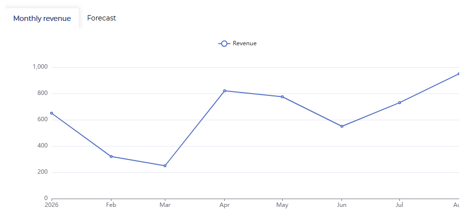
Note the following:
data-grexx-chart-datasettakes the ID of the dataset. To find the ID, open the dataset in your Studio and copy the ID from the address bar.data-grexx-chart-seriestakes a JSON array. Because the JSON contains double quotation marks, wrap the attribute value in single quotation marks.xColumnandvalueColumnrefer to the external references of the dataset columns, not their labels.- Values must already be in the dataset. If you need a total, average, or count per period, use an aggregate dataset.
- Values in the dataset must be numeric. If the value column for a row is empty or does not contain a number, "No data" is displayed in the tooltip.
- The chart is always 400 pixels high and fills the width of the widget.
- Users must have view rights on the dataset (as well as the widget) to view the data in the chart.
Configure the series
Each object in the data-grexx-chart-series array describes one series. The following keys are available:
| Key | Description |
|---|---|
type | The type of series: bar, line, or area. An area chart is a line chart with the area below the line filled in. |
label | The name of the series, used in the legend and the tooltip. If not specified, the external reference of the valueColumn is used. |
xColumn | The external reference of the dataset column to plot on the x-axis. The column should contain numeric data (integer, double or long) or a numeric datetime. |
valueColumn | The external reference of the dataset column to plot on the y-axis. The column should contain numeric data (integer, double or long). |
dataType | Set to column to plot every row in the dataset. Set to row to plot only the rows that match typeColumn and typeValue. See Plot one series per category below. |
typeColumn | For "dataType": "row", the external reference of the column to filter on. |
typeValue | For "dataType": "row", the value that typeColumn must match. |
coefficient | A number that every value is multiplied by. Use this to convert units. For example, to plot values recorded in grams as kilograms use 0.001. |
unit | A unit that is appended to the value in the tooltip. For example % or kWh. |
dataset | The ID of a dataset to use for this series instead of the chart's dataset. Use this to combine data from more than one dataset in a single chart. |
yAxisIndex | Set to 1 to plot the series against the second y-axis. Defaults to 0 (the first y-axis). |
color | The color of the series, as a CSS color value. |
negativeColor | An alternative color for negative values. See Color negative values differently below. |
colorLowerBound and colorUpperBound | The thresholds used with negativeColor. |
smooth | Set to true to draw a line or area series as a curve instead of straight segments. |
additionalData | An array of [x, y] pairs that are added to the series alongside the data from the dataset. Use this to add a target or reference point that isn't in the dataset. |
Plot one series per category
If your dataset contains one row per category (such as one row per department per month), use "dataType": "row" to split those rows into separate series. Each series filters the dataset down to the rows for one category:
<div
    class="grexx-charts"
    data-grexx-chart-dataset="1:2345:67890"
    data-grexx-chart-series='[
        {
            "type": "bar",
            "label": "Sales",
            "dataType": "row",
            "typeColumn": "department",
            "typeValue": "Sales",
            "xColumn": "month",
            "valueColumn": "spend"
        },
        {
            "type": "bar",
            "label": "Marketing",
            "dataType": "row",
            "typeColumn": "department",
            "typeValue": "Marketing",
            "xColumn": "month",
            "valueColumn": "spend"
        }
    ]'
></div>
Color negative values differently
To draw negative values in a different color, add negativeColor to the series. Values above colorUpperBound use color, values below colorLowerBound use negativeColor, and values in between are drawn in grey.
If you don't specify the bounds the threshold is set at zero, so positive values use color and negative values use negativeColor. Set the bounds explicitly if you want a neutral band around zero, for example to draw a variance of less than 5% in grey:
{
    "type": "bar",
    "label": "Variance",
    "xColumn": "month",
    "valueColumn": "variance",
    "dataType": "column",
    "color": "#3ba272",
    "negativeColor": "#ee6666",
    "colorLowerBound": -5,
    "colorUpperBound": 5
}
Configure the axes
Charts have one x-axis and either one or two y-axes. Configure each axis with its own set of attributes: data-grexx-chart-x-axis-*, data-grexx-chart-y-axis-*, and data-grexx-chart-y-axis2-*.
| Attribute | Description |
|---|---|
-show | Set to false to hide the axis. The x-axis and the first y-axis are shown by default. The second y-axis is hidden by default: set it to true if you use "yAxisIndex": 1 in a series. |
-type | Set to time for dates and times, or value for numbers. The x-axis defaults to time; both y-axes default to value. |
-name | A label for the axis as a whole, such as Revenue (€). |
-name-location | Where the axis name is positioned: start, middle (default), or end. |
-name-gap | The distance in pixels between the axis name and the axis. Defaults to 15. |
-unit | A unit that is appended to each axis label, for example %. |
-rotate | The angle in degrees to rotate the axis labels by. Use this when long labels overlap. |
-min and -max | Fixed numeric limits for the axis. If you omit them, the limits are calculated from the data. |
-date-format | For a time axis, the format used for the axis labels. See Date and time formats. |
For example, to show a percentage on the y-axis and abbreviated dates on the x-axis:
<div
    class="grexx-charts"
    data-grexx-chart-dataset="1234567890"
    data-grexx-chart-x-axis-date-format="d MMM"
    data-grexx-chart-y-axis-name="Uptime"
    data-grexx-chart-y-axis-unit="%"
    data-grexx-chart-y-axis-min="0"
    data-grexx-chart-y-axis-max="100"
    data-grexx-chart-series="..."
></div>
If you don't set -min and -max for a y-axis, the calculated range always includes zero. Set both attributes if you want the chart to zoom in on a narrow band of values, such as temperatures between 18 and 22 degrees.
Use a second y-axis
To plot two series with very different ranges on the same chart, such as a revenue total and a conversion percentage, assign one series to the second y-axis and make that axis visible:
<div
    class="grexx-charts"
    data-grexx-chart-dataset="1:2345:67890"
    data-grexx-chart-y-axis-name="Revenue"
    data-grexx-chart-y-axis2-show="true"
    data-grexx-chart-y-axis2-name="Conversion"
    data-grexx-chart-y-axis2-unit="%"
    data-grexx-chart-series='[
        { "type": "bar", "label": "Revenue", "xColumn": "month", "valueColumn": "revenue", "dataType": "column" },
        { "type": "line", "label": "Conversion", "xColumn": "month", "valueColumn": "conversion", "dataType": "column", "yAxisIndex": 1 }
    ]'
></div>
Customize axis labels
If the options above aren't enough, use data-grexx-chart-x-axis-axis-label, data-grexx-chart-y-axis-axis-label, or data-grexx-chart-y-axis2-axis-label to pass an ECharts axisLabel object as JSON. For example, to display the axis labels in bold:
data-grexx-chart-y-axis-axis-label='{"fontWeight": "bold", "fontSize": 14}'
An axisLabel object replaces the handling of the -rotate and -unit attributes for that axis. Include the rotate and/or formatter settings in the ECharts JSON object as required.
The attribute name contains "axis" twice, because it combines the axis name with the ECharts axisLabel option.
Configure the chart
The following attributes apply to the chart as a whole:
| Attribute | Description |
|---|---|
data-grexx-chart-dataset | The ID of the dataset to plot. Required, unless every series specifies its own dataset. |
data-grexx-chart-series | A JSON array of series. See Configure the series above. |
data-grexx-chart-case | The ID of the case to use as the context for the dataset. Defaults to the case currently being viewed, so a current case filter on the dataset works as expected. |
data-grexx-chart-show-legend | Set to false to hide the legend. Shown by default. |
data-grexx-chart-series-hidden-initially | A JSON array of series labels that are hidden when the chart is first displayed. Users can select items in the legend to show and hide series. |
data-grexx-chart-zoom-enabled | Set to true to add zoom and reset zoom buttons to the chart. |
data-grexx-chart-save-as-image-enabled | Set to true to add a button that downloads the chart as an image. |
data-grexx-chart-show-y-axis-units | Set to true to append each series' unit to the labels of the y-axis it is plotted against. If several series are plotted against the same axis, the unit of the first of them is used. A series unit takes precedence over the -unit attribute of the axis. |
data-grexx-chart-tooltip-decimals | The number of decimal places used for values in the tooltip. See Round the values in the tooltip below. |
data-grexx-chart-update-interval | How often the chart reloads its data, in seconds. If not specified, the data is loaded when the template is rendered and whenever the template is refreshed. |
data-grexx-chart-font-family | The font used for the legend, tooltip, and axis labels. |
data-grexx-chart-grid-top | The space in pixels between the top of the widget and the plot area. Defaults to 60, which leaves room for the legend. Increase the value if a long legend overlaps the chart. |
data-grexx-chart-show-full-day | See Show a complete period below. |
data-grexx-chart-show-full-week | See Show a complete period below. |
data-grexx-chart-show-full-month | See Show a complete period below. |
data-grexx-chart-show-full-year | See Show a complete period below. |
Round the values in the tooltip
By default, values in the tooltip are rounded to two decimal places. Use data-grexx-chart-tooltip-decimals to change this:
| Value | Result |
|---|---|
A number from 0 to 20 | Rounds to that number of decimal places. |
axis | Uses the same number of decimal places as the labels on the y-axis that the series is plotted against. Use this to make sure the tooltip never shows more precision than the axis does. |
none | Displays the value exactly as it is stored, without rounding. |
Whole numbers are never padded with zeros: with two decimal places, 5 is displayed as 5 and 5.125 as 5.13.
Because axis follows the axis labels, it rounds to whole numbers when the axis labels are whole numbers. If your values are small but your axis covers a wide range, set a number of decimal places instead.
Show a complete period
When you plot a period of time, the chart normally starts at your earliest data point and ends at your latest one. If a day, week, or month has no data at all, it is not shown. Use the show-full- attributes to display the whole period instead, with gaps where there is no data:
data-grexx-chart-show-full-daysets the x-axis to run from the start to the end of the day that your data falls in.data-grexx-chart-show-full-weeksets the x-axis to run from Monday to Sunday of the week that your earliest data point falls in, and adds an empty point for each day of that week that has no data.data-grexx-chart-show-full-monthsets the x-axis to the month that your earliest data point falls in, and adds an empty point for each day of that month that has no data.data-grexx-chart-show-full-yearsets the x-axis to the year that your earliest data point falls in, and adds an empty point for each of the twelve months that has no data.
Use one of these attributes at a time. If you set more than one, the longest period wins.
Plot times without dates
If the column on a time x-axis contains a time rather than a full date, such as 14:30, the chart plots it against today's date. This is useful for charting a daily profile, such as energy use per hour, but it means the chart only ever shows one day.