Add a navigation bar to your application
To help your users navigate to different parts of your application, you can add navigation bars. A navigation bar can take the form of a bar along the top or down one side of your application. It can contain links at both the top level and nested within sub-menus, as well as headings, text, and icons. You can display a single navigation bar or add multiple navigation bars (such as a top bar and a side bar) to the same view.
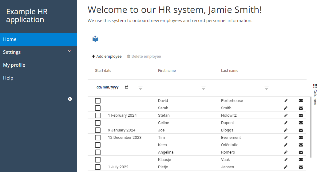
Configure a navigation bar
With Grexx Platform, you can configure one or more navigation bars and then specify which navigation bar(s) you want to display on each view. This makes it easy to make navigation consistent throughout your application while giving you the flexibility to vary it when required.
Configuring multiple navigation bars allows you to address different use cases. For example, you might have a primary navigation bar that includes links to all parts of your application, and an alternative navigation bar with fewer items for use on your application's public pages.
To set up a navigation bar:
- From the Studio menu, open the Navigations page and click Add navigation.
- Enter a name to help you identify the navigation bar easily.
- From the Type list, choose where you want to position the navigation bar in your application. You can choose between a bar across the top of the webpage or a sidebar on either the left or right-hand side.
- If you have configured CSS for your application, you can specify the CSS class for the navigation bar in order to apply the relevant styling. If you don't specify a CSS class, the default Grexx Platform styling is applied.
- When you are ready, click Submit. An empty navigation bar is created.
The next step is to add menu items and other elements to the navigation bar:
- Select the new navigation bar from the list and then open the Menu items tab.
- Click Add menu item and enter a name to identify the menu item in your Studio.
- From the Type list, select the type of menu item you want to add and then configure it as appropriate:
- Link: Add a link to a specific page in the application or to an external web page. Enter the link destination in the href box:
- To link to the main view of a page casetype, enter either the URL path or
page/followed by the page alias (for examplepage/settings). To link to a page with the aliashomeorhomepage, only the alias is required - do not preface it withpage/. - If you have created multiple views for a page casetype and you want to link to a view other than the default view, include the view ID (for example,
page/settings?view=1:6789:1234). - To create a dynamic link, use an inline template. For example, to create a link to the view of the logged in user, use the
Url.Case Urlfunction and set the case identifier toUser.Current user. To link to the view of another case (such as anEmployeeorCustomerview) configure the template to link to a case attribute containing the relevant case ID. - For external links, enter a fully qualified URL (for example,
https://www.example.com).
- To link to the main view of a page casetype, enter either the URL path or
- Menu: Add a menu item so that you can nest sub-menu items below it. To make the menu item itself a link, enter the link destination in the href box. Once you have added a menu, you can add multiple sub-menu items to it, including links, text and custom HTML.
- Template: Use a saved template to define the menu item. This is useful if you want to reuse the same custom HTML in multiple places or make the text dynamic based on data from your application.
- Text: Display static text within the navigation bar.
- Title: Display static text as an H3 heading in the navigation bar.
- HTML: Define the menu item using HTML. You can use this option to create a link, display text, display an image, and more. For example, you could use the following HTML to display an image and make it a link to a page with the alias
home:In this example, the image source is an inline template which references a static file that has been uploaded to your Studio via Platform > Static files.<a href="/home"><img src="Static file url ❲Logo❳"/></a>
- Link: Add a link to a specific page in the application or to an external web page. Enter the link destination in the href box:
- For each menu item, enter the text you want to display on the navigation bar in the Text box. You can also use HTML tags to format the text.
- To apply a specific CSS class from your application CSS to the menu item, enter the class name in the CSS Class box.
- To display an icon alongside the text, use an inline template to reference an image file you have uploaded to your Studio via Platform > Static files. To configure the template, type
file.and then select aStatic fileoption from the list. Click the blue text to configure the template to reference the appropriate file. This option is not available forTextandTitlemenu items. - To control the order in which items are displayed on the navigation bar, enter a number in the Order box.
- When you are ready, click Submit to add the menu item to the navigation bar. Add further menu items as required.
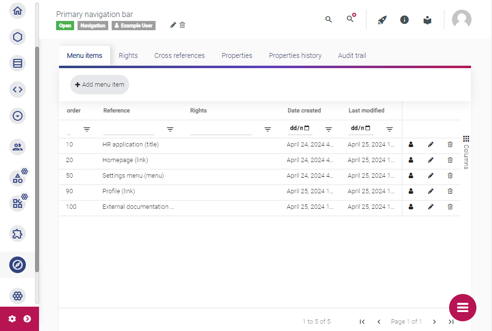
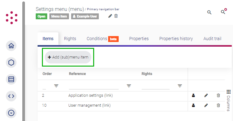
To create a sub-menu, select the relevant menu item from the list and then click Add (sub)menu item. Only add sub-menu items to items of type Menu. Sub-menu items added to other item types are not displayed.
Grant users permission to menu items
From October 2025, you no longer need to grant users rights on the navigation bar itself.
Once you have configured a navigation bar, you need to grant one or more user roles the right to view each item on the navigation bar.
- From the Navigations page, select the navigation bar and then select the Menu items tab.
- For each item, click the user icon to open the Create right dialog.
- Select the user roles that you want to grant permission to see the menu item. For example, you might want to grant rights to the
Homepagemenu item to the defaultAuthenticated userplatform role so that all logged-in users can see it, but restrict visibility of a user management menu item to users in theAdministratorrole. - When you are ready, click Submit. The roles that have been granted rights are listed.
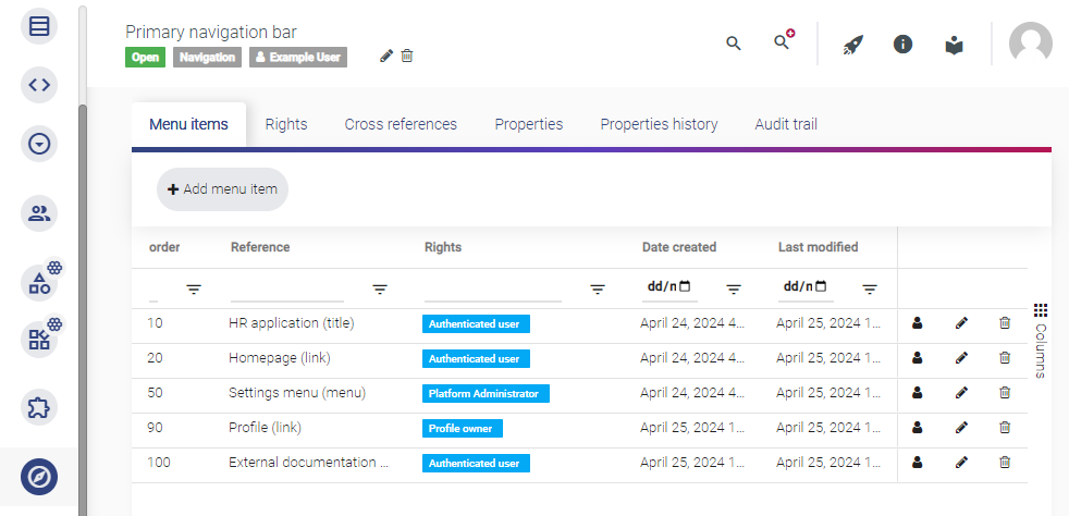
- Repeat this process for the other menu items. If you have created a sub-menu, select the parent item to view the list of sub-menu items and then add rights to each item.
When you deploy your application to any of your environments (Development, Testing, Acceptance, or Production), users in the selected role(s) will be able to see the relevant items on the navigation bar. If a user does not have permission to view any of the items, they will see an empty navigation bar.
For more information about user roles, see Configure user roles.
Granting rights to view a menu item does not grant rights to view the content in the associated view. To grant a user role permission to view content, grant rights to the relevant widgets in the view. For more information, see Configure pages and views.
Add a navigation bar to a view
When you add a navigation bar to a view, you specify the active item for that view. You can then use CSS to highlight the active item so that users can locate themselves within your application.
To add a navigation bar to a view:
- From your Studio, open the relevant casetype. This can be a page casetype or a standard casetype.
- Select the Views tab and open the relevant view.
- Below the view title, click the pencil icon to open the Edit view dialog.
- From the Navigation settings section:
- Select the navigation bar you want to add to each position: top, left-hand side, or right-hand side.
- For each navigation bar that you have added to the view, use the Active picklist to identify the item in that navigation bar that relates to the current view (if any).
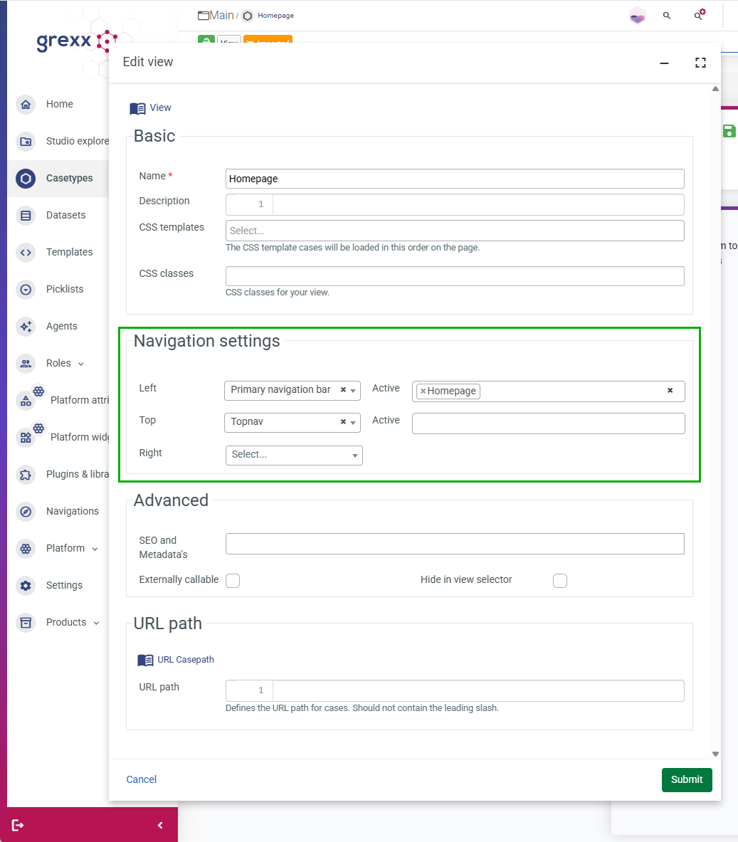
- When you are ready, click Submit. The view properties are updated.
When a user opens the view in one of your environments (Development, Testing, Acceptance, or Production), the navigation bar is displayed and the active item is highlighted (in accordance with your application's theme and/or CSS). If a user cannot see the active item, check that their user role has been granted rights on the menu item.