Casedata (form) widget
A casedata widget (also known as a form widget) allows you to display data from a single case using a form. The form defines both the attributes that are displayed and the order of the fields.

When you add a casedata widget to a view, you must select the form you want to use. You can re-use an existing form, such as the default Casedata or Start <casetype> form, or create a dedicated form to use with the widget.
Case selection
By default, the casedata widget displays details of the case being viewed. For example, if you include a casedata widget on a view for a Customer casetype, when you open the view for a specific customer, the widget displays the details of that case.
You can also use a casedata widget in conjunction with a grid widget or tile widget to display details of the selected case. For example, you may want to use a grid widget to display a list of customers on your homepage, and use a casedata widget to display more details of whichever customer the user selects. To enable this, select the grid or tile widget from the Master widget list. If you have selected a grid widget, ensure that in the grid row options, the Click action is set to None. To customize the message that is displayed when no case is selected, select a template from the No selection template list.
You can also configure a grid widget to open the view of the selected case. For more information, see Display additional case details in the Grid widget reference.
Widget style
Three styles of casedata widget are available:
- Form style: The form is formatted in the same way as an activity widget, but the form is read-only. If form logic has been configured, this is applied and determines what is displayed.
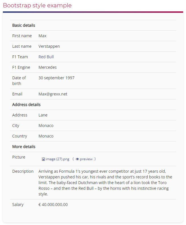
- Bootstrap style: The form is formatted using bootstrap by default. Additional options allow you to control what is displayed.
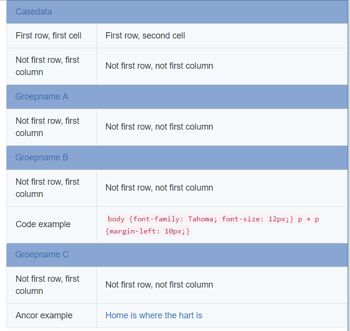
- You can modify the bootstrap styling by applying a CSS class to the widget and adding a CSS template (with the relevant class) to the platform, casetype or view. An example is provided below. Note that if you apply a CSS class without adding a CSS template, the form is rendered as an unformatted HTML table.
- Enable Execute form logic to execute any form logic that hides or shows fields (or groups of fields) or changes field labels before displaying the form. Note that any other form logic is not applied.
- Enable Exclude empty values to hide any form fields that do not contain any data.
- By default, if a field contains a case ID, the value is rendered as a link to the case. Enable Disable case links to display the value(s) as static text.
- Grid style: The form is formatted using the same styles as a grid widget. This is a legacy option and should not be used for new casedata widgets.
Example CSS
You can include the following CSS in a template and apply it to the platform, casetype, or the specific view that contains the widget. Adapt the CSS rules as required and ensure you give the widget the class rmh-casedata.
    .rmh-casedata
    /*everything*/

    {
      width: 100%;
      &:before/*before*/
      {
        content: 'Casedata';
        background-color: #88a6d1;
        color: #4470af;
        margin-bottom: -1px;
        padding: 10px 15px;
        width: auto;
        border-top-left-radius: 4px;
        border-top-right-radius: 4px;
        display: table-caption;
      }
      &:after/*after*/
      {}
      tbody > tr.group/*all groups*/
      {
        background-color: #88a6d1;
        color: #4470af;
        td/*all groups*/
        {
          padding: 10px 15px;
          &:first-child/*first column*/
          {
            border-top-left-radius: 4px;
          }
          &:not(:first-child)/*next columns*/
          {
            border-top-right-radius: 4px;
          }
        }
      }
      tbody > tr:first-child td/*first row*/
      {
        &:first-child/*first cell*/
        {}
        &:nth-child(2)/*second cell*/
        {}
      }
      tbody > tr:not(:first-child) td/*not first row*/
      {
        &:first-child/*first column*/
        {}
        &:not(: first-child)/*next columns*/
        {
          a/*anchor*/
          {
            &:link {}
            &:visited {}
            &:hover {}
            &:active {}
          }
          code/*code tag*/
          {
            &:hover/*hover on code tag*/
            {}
          }
        }
      }
      tbody > tr:not(.group) td/*all rows without groups*/
      {
        background-color: #f6f9fc;
        padding: 10px 15px;
        border: 1px solid #ddd;
        margin-bottom: -1px;
        &:first-child/*first column*/
        {
          border-left: 1px solid #ddd;
        }
        &:not(:first-child)/*next columns*/
        {
          border-right: 1px solid #ddd;
        }
      }
    }
This results in the following:
